Thursday 31 October 2013

9. Comparing Front Cover Photography


These two magazine front covers contain great images which are very appropriate for the individual magazines. The first (Vanity Fair) uses the rule of thirds to compose their image. Looking at the whole image, the subject is along the right vertical third line, and her legs are along the bottom horizontal line. Although when you look at her face, you can see that the text almost crops the rest of the image, leaving her arm and face. With the 'cropped' image, her eyes are along the top third, her head on the left third and her arm starts along the bottom third. The use of lines is very good as they have used her body to give perspective. Her arms and legs create lines, giving a accurate perspective on the proportion of her body. The angled arms and legs draw your attention to her face, making it the focal point. The face is clearly the focal point as it is the lightest part of the image. She is in a black outfit and the background is grey, so that helps with making her face stand out from the rest of the image. The photographer was a little lower than the subject as you can see that she is making eye contact, but is looking down at the reader. 

The second magazine (The Source) uses rule of thirds to divide up the image used for the front cover. The eyes of the subject (even though they are closed) line up with the top line of the rule of thirds grid. The gun is almost on the bottom third line. Even though the image is fairly central, it still uses the rule of thirds well. The text either side of the subjects face seems to crop the image, leaving you to focus on his face. You can split it up into thirds, as his eyes sit on the top third, his lips are along the bottom and then both his eyes are on separate vertical lines on the grid. For lines, the gun creates a line which you follow up to look at the subjects face. The straps on his vest also do a similar thing, making you look up. The angle that the photo was taken at is pretty straight on, although the subject is looking up slightly, looking like the photo was taken from a lower angle. The focal point is his face as it is one of the brightest areas. It is surrounded by darker aspects of the image, making it stand out a lot more. You are also lead to focus on the gun, which is also bright and visible. These two points would probably be the two fighting for your eyes attention. The last thing you may focus on would be the text to the left of the image 'The Game' and possibly 'suicide is not an option'. These stand out as they are a completely different colour to the image behind. 

Tuesday 29 October 2013

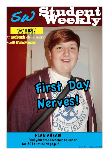
8. Final Cover for Student Weekly

 I think I was fairly successful with this cover. I included many of the conventions of a magazine, such as the plugs and puffs, the barcode, the coverlines in the left third, the issue number and date. 
The image used was a good choice, although I could have taken it outside where it was brighter, rather than inside with the flash. 
I think that the barcode is a little too big, so next time, I would make it smaller, and perhaps add another coverline to fill in the empty gap. 
The coverlines are appropriate and are related to college life, and student interests. They would hopefully attract students to read further, as there are plenty of free giveaways and things to win. 
The main coverline is pretty eye-catching, but it could be a little bolder. I could have used a different text to make it stand out more. 
To make the whole cover more interesting, I could have added some more images or photos to go with the coverlines. 
I think that the colours I have used are appropriate as there are not too many (this would make it look random and untidy). The colours I have chosen are going to be the standard theme colours throughout the issue. 
The layout of the whole cover is quite good as the coverlines don't overlap the image, and they are not too close together. There are a few gaps, but this gives the cover a sense of organisation as it isn't busy and crammed in. 


8. Contents Page For Student Weekly

The contents page follows the same design as the front cover, making the magazine seem organised. 
The images are well spread out around the page, and are not too close together. There are not too many of them either. 
I think that the contents page is a little boring, as there are only a few colours. I think that it would look better with the images as they would make the page more colourful. 
I have kept the same colours for the contents page so it is clear that it is from the same magazine. 
To improve, I could have added more page numbers, to make it seem like there are a lot of interesting topics and articles inside. 
I could have also made the page information seem more interesting, although if I made the text any smaller it would be difficult to read, and wouldn't be as noticeable.

Monday 21 October 2013

7. Proposal For College Magazine


My college magazine is going to be aimed at teenagers, roughly aged 16+, who go to college. The magazine will contain local college news, tips, issues, events and relevant information about what’s going on in and around college. I have a few ideas for coverlines, these include:
·      - Win! An iPod touch and a £15 iTunes voucher
·      - Your views on your courses
·      - Free café vouchers inside
·      - New, upcoming events near you
·      - Cheap, local places to shop
·      - Start planning for the year ahead! Find an academic calendar on Page 6
·       
I have decided on the title ‘Student Weekly’. I chose this title as it is simple and quickly explains who the magazine is aimed at and what it will mainly be about. I rejected these titles:
·      - College Weekly
·      - College Life
·      - Off To College
I rejected these as, even though they are appropriate, I though that they weren’t as straightforward. I wanted it to be simple and get the idea across quickly. I thought that ‘Student Weekly’ was the most appropriate masthead. I think I will use big, bold fonts (sans serif) for the masthead and main coverlines. I will use thinner, smaller (serif) text for the less important coverlines and the issue information. I have decided that the magazine will be printed in September/October, when students have started college and have begun to settle in. I will use autumn colours, such as red, orange and yellows to reflect the time of year it is published in.

The image on the front cover will be of a student, with their bag (ready to go to college, perhaps). They should have a happy facial expression and be stood up straight, enthusiastic to go to college. It should be taken inside, during the day, giving the idea that the student is about to leave for college. It will be published weekly (hence the name of the magazine).

The colours on the contents page would relate to the colours on the front cover. They would be similar to the masthead colours. The images on the contents page would be related to the topics and articles inside. They wouldn’t be too bright and bold, otherwise it would distract you from the text, so they would have to be subtle and calm.

7. Initial Ideas For College Magazine

Coverlines:
  • Win! An iPod Touch and a £15 iTunes voucher
  • Cheap, local places to shop
  • Cafe vouchers inside
  • Plan ahead! Find your free academic calendar inside
  • New! Up and coming events near you
  • Tips and tricks for writing the perfect CV
  • Looking for a job? A car? A flat? Check out our local ads on page 19
  • Read about the latest college trips inside
  • New to the college? Can't find your way around? Find out new, updated college map on page 3
Photo:
  • Medium close up
  • Happy, excited, enthusiastic facial expression
  • Carrying college bag
  • Outside
  • Sunshine (if possible)
Masthead:
  • Student Weekly
  • College Life
  • College Weekly
  • SDC
  • College Student
  • Student Life
Text:
  • Bold (Sans serif) for masthead and most coverlines
  • Thin, simple (serif) for smaller, detailed text, such as page numbers, issue number and the date
Target Audience: 
  • Both genders
  • Students
  • Teenagers at college
  • 16+
Colours:
  • Blues
  • Black
  • Yellow
  • Bright, eye-catching
Content:
  • Local news
  • Tips
  • Events
  • Issues
  • Real life stories
  • Helpful articles
  • Reviews


Friday 11 October 2013

6. IPC Media

What  types of magazines and target audiences has IPC been associated with over the years?
IPC has been mostly associated with woman's weeklies (such as Chat, Pick Me Up, Woman and Woman's Weekly) and sport & leisure magazines (such as Cycling Weekly, Rugby World, What Digital Camera and World Soccer). These types of magazines are most likely targeted at middle aged women (for the woman's weeklies) and middle aged men (for the sport & leisure magazines). These men and woman are probably between high working class, and low middle class, meaning that they can afford to buy these magazines every week. It also means that they have time to sit and read them each week, which suggests that they have a lot of time on their hands, so perhaps are a little older and retired. 

Why might IPC be an appropriate publisher for a new music magazine?

I think that IPC would be an appropriate publisher as they currently only publish one music magazine (which is very popular among teenagers and young adults). They have plenty of experience as NME has been running for 61 years (from 1952). I think that releasing a second music magazine now would be appropriate time as it has been so long since the last. 

What sorts of genres of music/types of magazines might they be likely to publish?

IPC are most likely to publish alternative music genres in their magazines. They would also publish topics that would be of interest to the people that listen to the music from the magazine. IPC are likely to publish womans weeklies, as they continue to be a popular magazine among women. They are also likely to publish TV entertainment magazines, as they are also still very popular. People still read TV magazines to find out what is on TV that week. 

Why might alternative publishers like Bauer be appropriate?

Bauer might be an appropriate publisher as they also already publish multiple music, entertainment and radio magazines for a range of genres. These magazines are aimed at a wider audience. The magazines include: 
  • Kerrang!
  • Kiss
  • Magic
  • Empire
  • Mojo
  • Q

Thursday 3 October 2013

5. Magazine Responsibility Question


To What Extent Should Magazines Be Held Responsible For The Social Ramifications Of The Representations They Offer?

Magazines are widely read by young teenage girls looking for entertainment and celebrity gossip. In the past, teens read girly magazines just to keep up with all the latest gossip. Nowadays, girls read them to find out how to get ‘that body’ and how to make their hair perfect. Girls are affected massively by content in these magazines, and it makes them question whether they are good enough, and often leads to them adapting their bodies to reach the required standards in the magazines. The magazines also talk about sex, and being sexy. I think that this would make teens grow up way too fast. At 12 or 14, they don’t necessarily need to know all the details about having sex, or being in a relationship. Magazines for teenage girls aren’t age appropriate. Magazines such as Sugar, Cosmo Girl, More! and Bliss have content and coverlines that aren’t appropriate for young teenage girls. Telling them how to get the perfect hair, or how to be the best at snogging. Some of the content however, can be appropriate. Real life stories that would make young teenagers think about their own lives, and with stories about drunken disasters and similar events, it may make teens more careful in the future.

Of course magazines are not the only media source that affects young girls. TV shows and any media content on the internet also has a huge effect on girls views of themselves. They can access so much on the internet that could not be aimed at them as it has not been censored or age restricted. 12 year old girls could easily look up photographs of topless celebrities and come across an inappropriate naked photo instead. The majority of teenage girls now have their own TV, and if not, they at least have access to one. With their own TV, they can watch any show that they wish. They could watch a TV show with violence, nudity and swearing. All of these, mainly swearing, would influence girls to perhaps copy what they have witnessed. They may become a little more violent, or start swearing more.

Another culprit of effects on girls is the parents who brought them up. For example, the mother of the teenager is a loud alcoholic who swears a lot, then the teen would learn from her actions and perhaps copy them. They would certainly pick up the words and language used, and they would used it elsewhere, maybe even sharing it with their mates. On the other hand, if the girl had a fashionable, thin, pretty mother, the girl may look up to her and try to look, act and speak like her. Theses are both negative and positive influences, but they still effect the teen. 

I think that things related to sex, or other inappropriate topics should be removed from teenage magazines. I also think that images of celebrities with low cut or see-through clothing should be removed and replaced with sensibly dressed celebrities, suitable for teenage girls. 

4. Research Into Representation Of Girls In Girls Magazines

www.telegraph.co.uk/culture/culturenews/4990907/Teen-magazines-are-sexualising-readers-says-watchdog.html
www.associatedcontent.com/article/30544/popular_teen_magazines_and_their_possible.html

Some coverlines on girls magazines are obviously going to effect teens and their view on themselves. Inappropriate coverlines include:
  • "The results are in: LOVE SURVEY 2011" - Bliss
  • "Look prettier TODAY. 10 instant tricks to try right NOW." - Bliss
  • "Hottest party looks." - Cosmo Girl
  • "Glam makeup tips." - Cosmo Girl
  • "My sister slept with my boyfriend." - More!
  • "1 magic move to sexy abs." - Cosmo Girl
  • "Can you guess which girls work out and which don't?!?" More!
  • "SHOCKING REAL LIFE. I need sex every 4 hours." - More!
  • "Why girls are better in bed than men. 3 women spill all." - More!
  • "8 Signs he's using you for sex." - More!
  • "Sweet 16 shock. They groped my friends and stole my presents." - Sugar
  • "Get kissing confident. What every girl needs to know about snogging." - Sugar
  • "Instant sexiness. The look 72% of boys can't resist." - Sugar
  • "4 moves to a strong sexy body." - Cosmo Girl
  • "QUIZ; Are you too easy?" - Cosmo Girl
  • "Bad boys exposed. What he really thinks when he snogs you." - Cosmo Girl
  • "Push his buttons. Make him yours by text tonight." - Cosmo Girl
  • "We can't even remember how many girls we've snogged - The Wanted's rudest interview - Bliss
  • "Vodka made her a nightmare. What boys really think of boozy girls." - Bliss
  • "Big balls and nip slips - Our wild week with The Wanted." - Bliss
  • "How to have supersex." - More!
  • "The More! bikini body plan." - More!
  • "Sexy lingerie." - More!
  • "All new sex bible. 6 part special, this week: Foreplay." - More!
All of these coverlines would make teenage girls doubt that they're pretty enough. They may even dramatically change and adapt their bodies to feel accepted. Some of these coverlines expose way too much to girls of a young age. At 12 or 14, they don't need to know about sex tips, and how to be the best snogger. 

4. Representation of Girl's Magazines


These magazines all share similar codes and conventions, which make them suitable for the chosen audience. This audience would be girls, roughly aged from 8 to 14, maybe younger or even older, depending on maturity and interests. They are clearly aimed at the female gender, as these front covers contain extremely girls colours, such as pinks and red. I think that these types of magazines are aimed at girls who come from working class families, as the price of the magazine is fairly cheap and most of the magazines contain deals on fashion, make up and looking good. Although, it doesn't necessarily mean that the girls that buy these magazines come from working class families. They could be a lower price so that the girls are able to buy them with their own money, and younger children don't get a lot of money when they are younger. 

Plugs & Puffs
These magazines contain a lot of plugs and puffs, which make the reader think that they are getting something very exclusive and interesting if they buy the magazine. The text in the puffs contain a lot of numbers that will catch your eye, a lot of bold text, and the word ‘win’. All of these would persuade you to buy the magazine. Words such as ‘new’, ‘hot’ and ‘special’ are also included in the puffs. These words would possibly make you interested in reading further into the magazine.

Masthead
The mastheads of these magazines are all related to the colour theme of the rest of the front cover. The mastheads of the magazine are the same each time. The only things that are likely to change is the colour and sometimes the position slightly. The masthead is the same each time so that it becomes recognizable and iconic.

Coverlines
The main coverline of these magazines are usually the name of the celebrity on the front cover. The main coverline also matches the colour scheme of the masthead and the rest of the coverlines. They only seem to use around 4/5 colours. This makes it seem organized and more sophisticated, rather than random and busy. They also only use around 3/4 different text types, for the same reason.

Conventions
These magazines contain the usual conventions of any magazine. The front cover has a barcode, an issue number, a date and price. They are not always in the same place, but they are there somewhere. If you look at the two More! Magazines, they seem to stick to a similar layout and put the same conventions in roughly the same place on each front cover.