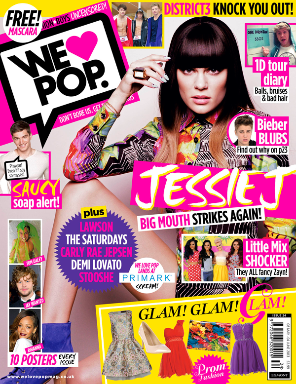
This magazine cover from We Love Pop is a great example of a typical pop magazine. It contains the colours you would expect on most pop magazines (yellow, pink, purple and white). The colour pink, in particular, is usually associated with the pop genre. These colours are intended to be appealing to teenage girls, rather than boys. The text used for the main coverline stands out and is one of the first things that you notice when you look at this front cover. It isn't as bold as some main coverlines, although the colour makes it noticeable. The main image is one of the standard style of image for a pop magazine. This particular image is of a female artist, which will attract young girls as they would possibly look up to them. These magazines can also have male artists, usually boy bands and groups which will attract young girls as they think they look good and 'fancy' them. The plugs and puffs are very bright and they are crowded along with the coverlines. There is almost always a plug advertising a 'free!' giveaway item with the magazine. The content is crowded on the front cover, which makes the magazine seem a little random, but it could also suggest that there is a lot of content in the magazine so it is worth reading. There are a lot of smaller images around the outside of the main image. These give you a good idea of what is inside and you instantly know what the article is roughly going to be about.
No comments:
Post a Comment